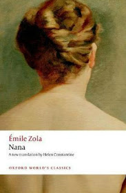
I wasn't waiting in vain; during Zoladdiction, Alok - one of the Zoladdicts (=Zola's enthusiasts) I follow on Twitter (@alokranj), shared OWC's upcoming translation of Doctor Pascal, yay finally! Of course, I immediately opened Book Depository, and pre-ordered it. Instead of immediately closing the website after transaction, however, I went on taking a peek at Nana's new edition, which I learned also from Alok (I learn many things on literature from him - he's worth a follow!) Then I found out that, apparently, besides Nana, OWC has also published (or going to publish) several other new editions of Zola's with NEW COVERS! And so, I'm sharing my enthusiasm with you today.
What I always love about OWC's edition of Zola's compared to other publishers, is, first, the translators (Brian Nelson is by far my favorite). Come to second, is the Impressionist paintings they use as covers (I also love their neat white ribbon for the title). Why it make a difference, while there are many paintings used for covers in the literary world? It's because of Zola's close relationship with Impressionism and its painters. If you look at his writing style, there's a thick quality of painting in it. The painting-covers has become an inseparable part of the novel itself - not merely a beautiful image to decorate a book. Therefore, you can imagine my astonishment when looking into the new covers of these four latest editions of L'Assommoir, Pot-Luck (Pot Bouille), The Masterpiece, and Thérèse Raquin - which use modern arts instead of Impressionist paintings!
Just look at these comparisons, and tell me - the new covers: yay or nay?
While there's new freshness from the red substances portrayed in these covers, they lost the interpretation of the novels. It looks pretty for decoration - and perhaps you would want to grab the book from a bookstore's shelf on impulse, especially if you love red color - but it doesn't have any meanings, and certainly doesn't represent the book's contents at all!
I don't know why OWC - which I have hitherto praised for their cover choices - decided this kind of change. Maybe they think the new covers represent vigorous life - which is indeed the essence of Zola's concept - but still, there are a lot of Impressionist paintings out there they could have picked for the new editions! They did that with Nana, why not all these four (and other titles in the future)?
What do think? Which version do you prefer? And why?


The new covers are an absolute NAY for me -- they add nothing to the context of the stories! I love the Impressionist covers and I'm glad that they haven't changed the final book so I'll have a chance to read it in the new edition with an appropriate image.
ReplyDeleteMy only quibble with the OUP art covers is The Joy of Life, which has a surrealist painting from the 1930s (a man and a nude woman dancing). It doesn't seem to fit with the others at all! What were they thinking, the book was published in 1883!
Agree, Karen! I thought I'm the only one who wished OWC didn't pick that painting for The Joy of Life! (-_-)
DeleteThat is really bizarre. I can't imagine they ran out of paintings to use (they could always do a different crop). I don't like the new covers at all, and I hope OWC isn't moving this direction for all their books. :(
ReplyDeleteI know, right? There are tons of paintings from the Impressionists they could choose from. Are they just lazy??
DeleteThe new red covers are odd! Maybe they thought the pictures were too dull? But I can't say I like the new ones very much myself.
ReplyDeleteMaybe to give the books new touch?? But at least they should think of something else than those red stuffs! :(
DeleteTo be blunt, I don't like those new covers at all. I mean, they are fine pieces of abstract art but have absolutely no idea what they have to do with Zola's novels. I can only assume they have done some market research and found that these types of front covers sell books. I'm so glad they didn't use it for the upcoming release of Doctor Pascal, which I'm also very excited for.
ReplyDeleteI completely agree, Alok has a great Twitter page, who I discovered through Zoladdiction.
They must have had a reason, true. But if they choose abstract art for the covers, at least they should pick ones that are related to the novel.
Delete