The April
prompt for A Classic Challenge picks Cover as the topic. It’s a good choice I
think, because cover—especially in classics books—speaks strongly of the entire
book. Actually I read 3 classics this month, but I will choose to discuss The
Great Gatsby by F. Scott Fitzgerald. I picked the Indonesian translation,
published by Serambi:
What I like the most
from this cover is the color, soft beige, which is the first thing that attired
my attention to the book. There are three persons, two men and one woman are
standing in the middle of a party took place in a mansion. That was my first
impression of this cover, and it turned out to match the book theme. The luxury
party and the snob expression of those three persons could reflect the moral
decadency of the “Jazz Age”. However, I can’t make a guess of who’s who in this
cover. The man in the front, is it Gatsby? Or Tom? If I was the illustrator, I
wouldn’t picture Gatsby like that. Gatsby, I think, is more a dreamer than a
snob (like the impression of the man in the front). I would rather picture him
as a gentleman with self esteem, who is throwing his gaze afar, as if he is looking
his fixed target, knowing that he will soon achieve it. I found this cover that
perfectly reflects my idea:
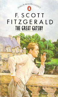
 |
| taken from listal[dot]com |
I also found another cover which accurately pictured Gatsby’s pose when Nick saw him for the first time, pointing his finger to the small green light from across the river. It reflects perfectly about dreaming for the future, reaching something that you can see from where you are standing. However this cover is too gloomy, you’d think it’s a gothic book! No, I won’t pick this!
 |
| taken from filmofilia[dot]com |
Back to the cover I am discussing, if the man in front is meant to be Tom, it would be strange because this book is about Gatsby, so it must be on Gatsby the cover is focusing. Well, I don’t know…and as the publisher didn’t put the illustrator name, I can’t ask him/her either. Overall, it seems that the woman (Daisy) is torn between the two men. She perhaps will choose the man in the front (Gatsby I presume), but she is somehow still attached to the man behind (Tom I presume), who is staring at her sharply, afraid of losing her. All in all, the whole cover can reflect the story quite well, but I think it’s poor in reflecting the character itself: The Great Gatsby!

I agree with you. Good thoughts:)
ReplyDeleteI think it's fun to analyze book covers!
Blessings.
Thanks Adriana. Yeah..it's fun indeed! Perhaps I'd like to do it on other covers too, if I have time. Thanks for stopping by!
DeleteI like the third book cover. I've not read this book, though I have read one or two of his short stories.
ReplyDeleteYah that's quite true
ReplyDelete